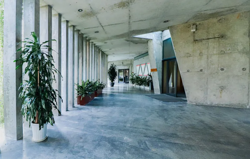
Lost on Purpose: The Case for Buildings That Let You Wander
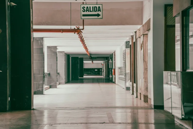
There is a particular kind of frustration that comes from entering a building so thoroughly labeled, so relentlessly signed, that you feel less like a person and more like a package being routed through a distribution center. Arrows on every floor. Color-coded corridors. Digital directories at every intersection. The message is clear: do not think, just follow.
This is wayfinding taken to its logical — and ultimately counterproductive — extreme.
The instinct behind comprehensive directional systems is understandable, even admirable. Buildings should be accessible. People should not feel disoriented or excluded. Safety codes, ADA compliance, and basic hospitality all demand a baseline of navigational clarity. But somewhere between the minimum required and the maximum deployed, something essential gets lost. The space stops being an environment to inhabit and becomes a problem to solve.
The Overcorrection We Rarely Question
Modern building design has grown increasingly anxious about user confusion. In commercial environments especially — corporate campuses, healthcare facilities, mixed-use developments — the fear of a lost visitor has driven wayfinding into a kind of arms race of signage. More markers. More digital touchpoints. More visual hierarchy imposed from above rather than discovered from within.
The result is spaces that communicate distrust. When every decision point is anticipated and labeled before you reach it, the implicit message to the occupant is: we do not believe you are capable of figuring this out. That is not hospitality. It is control dressed as helpfulness.
More critically, it forecloses the kind of incidental discovery that gives buildings their social and cultural vitality. The colleague you meet while taking an unfamiliar hallway. The atrium you stumble into between meetings. The coffee alcove tucked behind the stairwell that becomes, over time, the informal heart of an entire floor. These moments cannot be engineered through signage. They require a measure of productive ambiguity — space that invites interpretation rather than demanding compliance.
Spatial Hierarchy as a Quieter Language
The alternative is not chaos. It is not the willful removal of navigational logic in favor of architectural novelty. It is, rather, the use of spatial hierarchy — the ancient and deeply intuitive practice of letting the building itself communicate through form, light, scale, and material rather than through text and arrows.
Consider how the great civic buildings of the American urban landscape accomplish this. The grand hall of a train station does not need a sign that says "main concourse" because the volume, the light, and the convergence of paths make that legibility self-evident. The proportional shift from a service corridor to a primary circulation spine tells you, wordlessly, that you have arrived somewhere significant. These are environmental cues that operate beneath conscious thought, drawing on spatial instincts that human beings have developed over millennia.
This is the register in which the most sophisticated wayfinding operates: not as signage overlaid on architecture, but as architecture itself performing navigational work. A slight widening of a corridor near a destination. A ceiling that rises as you approach a gathering space. A change in floor material that marks the transition between realms. These are not decorative choices. They are communicative ones.
The Accessibility Tension, Honestly Addressed
It would be dishonest to discuss this subject without acknowledging the genuine tension at its center. For individuals with cognitive differences, low vision, or unfamiliarity with a building type, environmental cues alone may be insufficient. The architectural community has a real and non-negotiable obligation to ensure that spaces are navigable by the full spectrum of people who inhabit them.
But this obligation does not require the maximalist approach that has become default. It requires precision. Wayfinding for accessibility is most effective when it is targeted — concentrated at the moments of genuine ambiguity rather than distributed uniformly across every surface. A well-placed, high-contrast sign at a decision point where the spatial logic genuinely fails is worth more than twenty redundant markers in corridors where the path is already self-evident.
The discipline lies in identifying where the architecture succeeds on its own navigational terms and where it genuinely requires supplementation. That requires honest self-assessment from design teams — a willingness to ask not "where could we add a sign" but "where does this space actually fail to communicate."
What Exploration Does for People
There is a growing body of research in environmental psychology suggesting that mild navigational challenge — the experience of finding your way through a space that requires some active interpretation — correlates with higher engagement, better spatial memory, and a stronger sense of place attachment. Buildings that are too easily decoded tend to be forgotten. Buildings that reward attention tend to be remembered.
This has practical implications for commercial clients. A corporate headquarters where employees occasionally discover unexpected spaces, informal meeting areas, or views they had not previously encountered is a headquarters that sustains curiosity and, by extension, engagement. A retail environment that rewards exploration rather than funneling visitors along predetermined paths tends to generate longer dwell times and stronger brand associations. A cultural institution that allows visitors to construct their own sequence through a collection creates a more personal, and more lasting, relationship with its contents.
The goal, in each case, is not confusion. It is calibrated openness — the spatial equivalent of a good conversation that does not tell you exactly where it is going.
Guiding Without Commanding
The finest wayfinding is the kind that users never consciously register. They simply find themselves where they intended to be, or somewhere better. They moved through a building that seemed, somehow, to understand them — that anticipated their instincts without overriding them.
Achieving this requires restraint from designers and confidence from clients. It requires trusting that spatial intelligence, expressed through proportion, light, material, and sequence, is a more durable and more humane navigational tool than any amount of signage. It requires accepting that a degree of discovery is not a design failure — it is, in fact, a design achievement.
At RB Architect, this conviction shapes how we approach circulation and spatial legibility in every project we undertake. We design buildings that speak clearly without shouting. Environments that welcome without directing. Spaces that, in the best possible sense, invite you to find your own way through them — and make that finding feel like something worth doing.